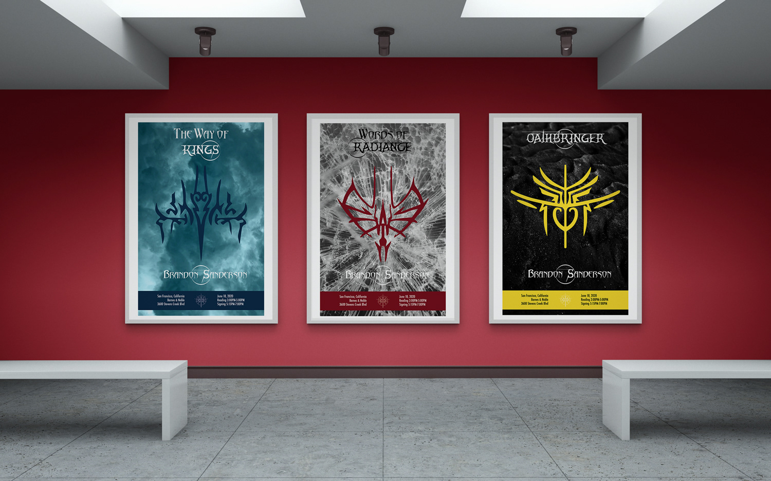
Each of these book tour posters represents a book from Brandon Sanderson's Stormlight Archive Series. I designed them to be informative but clean, so they could be hung anywhere without clashing with the environment. The symbol on each poster relates to the lore of the books, and they would be given out as promotional material for the next release in the series.
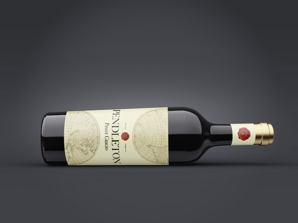
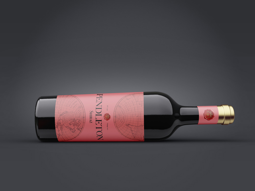
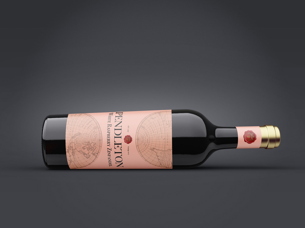
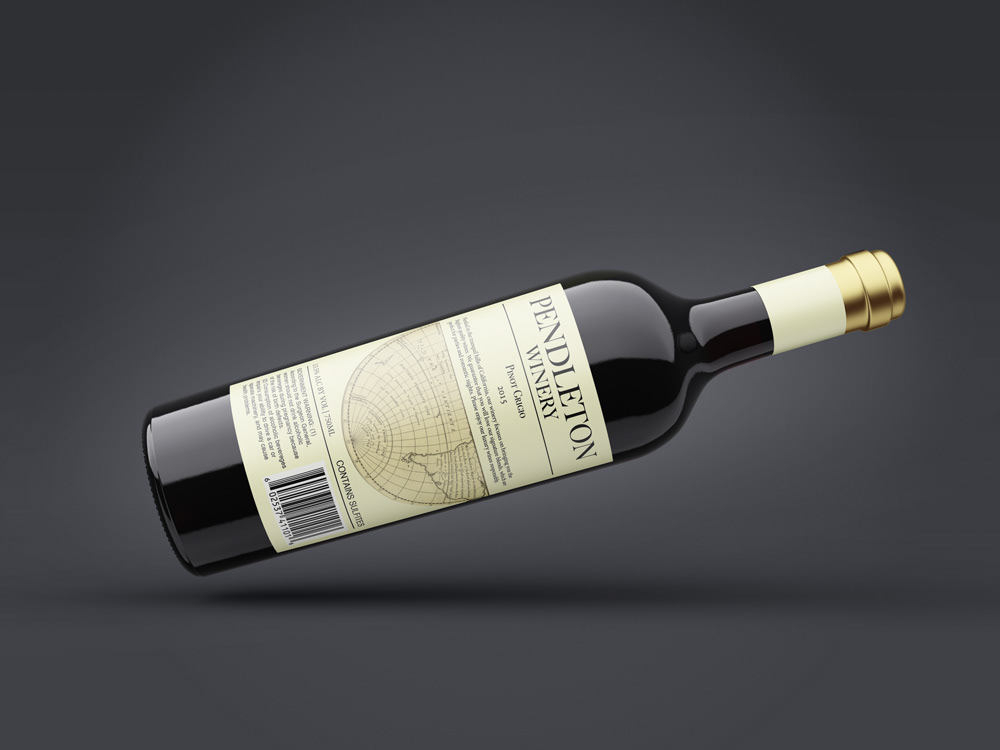
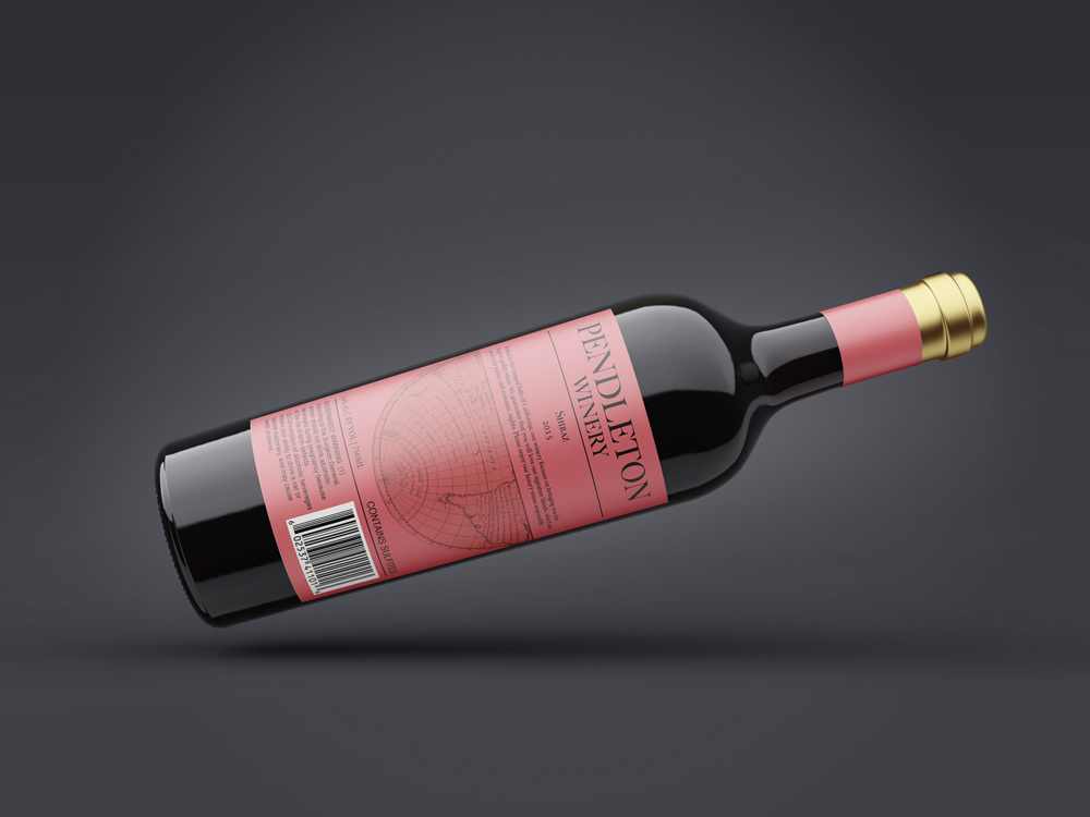
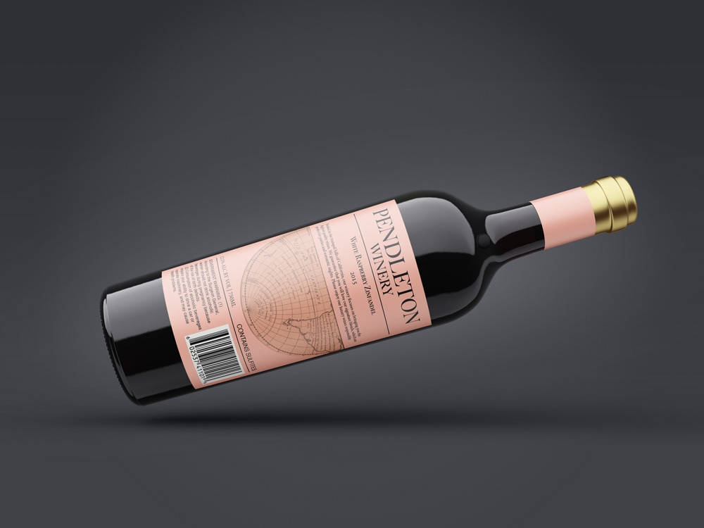
This brand uses color and iconography to produce a wine that people around the world can enjoy. The Pendleton name gives this wine a sense of history and elegance, increasing its appeal to high class clientele.
This advertisement utilizes grey scale to guide the eye and highlight important information. The simplistic layout of the poster reflects the modern, sharp look of Calatrava's architectural style.

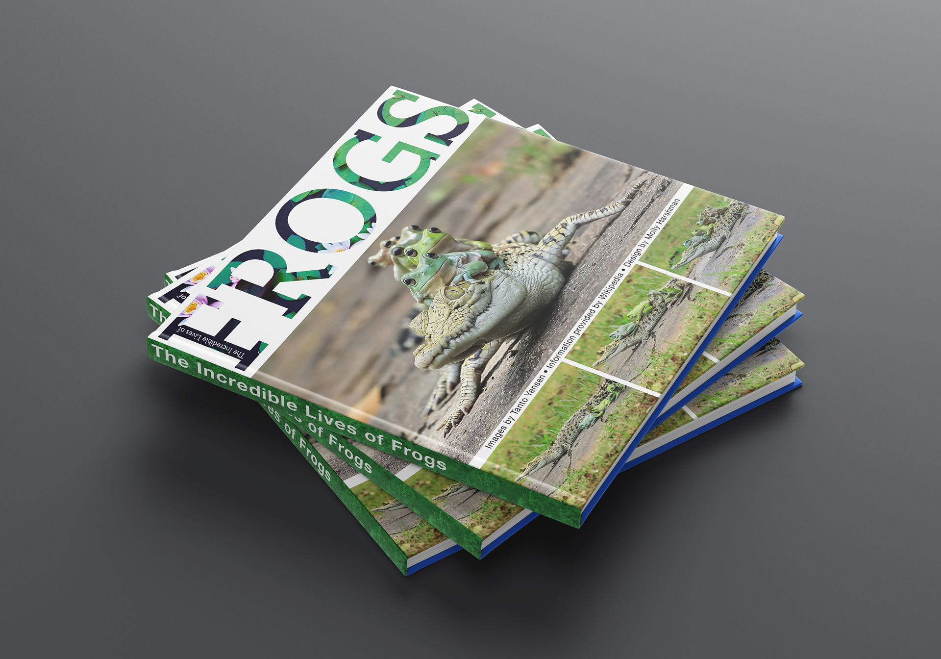
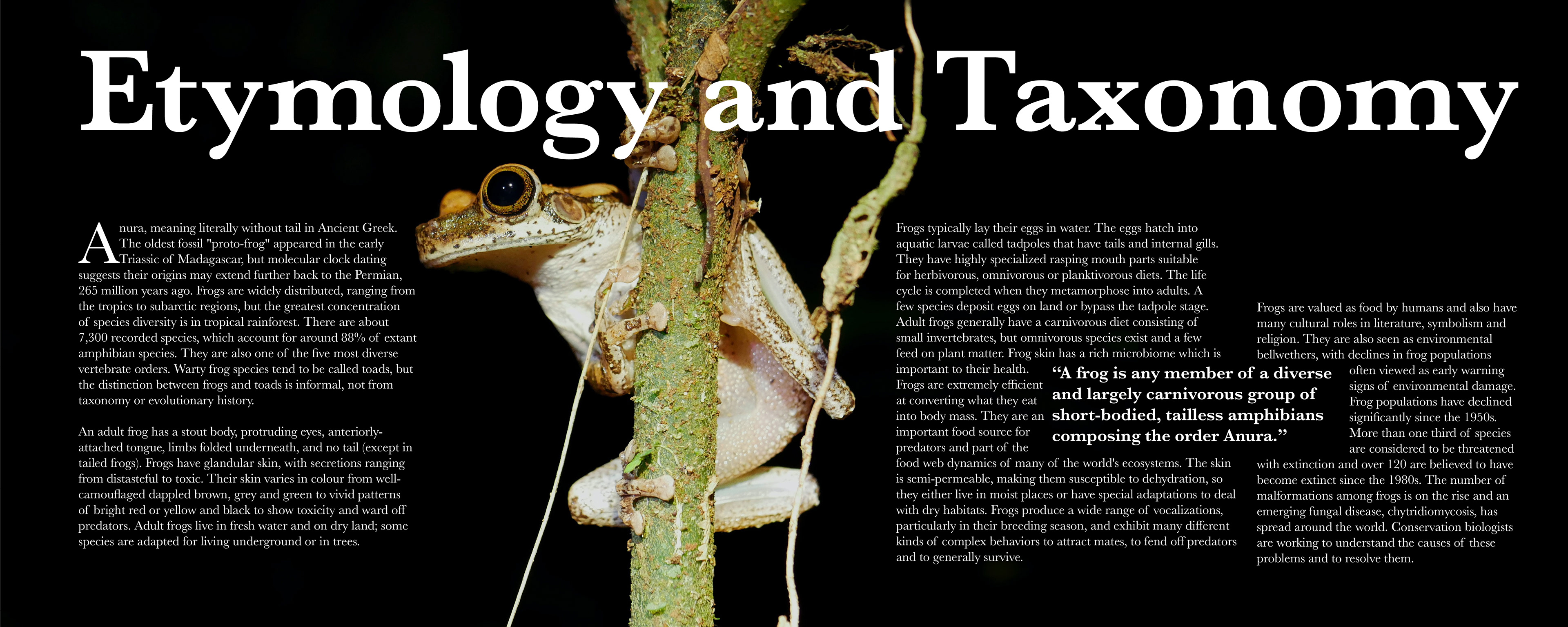
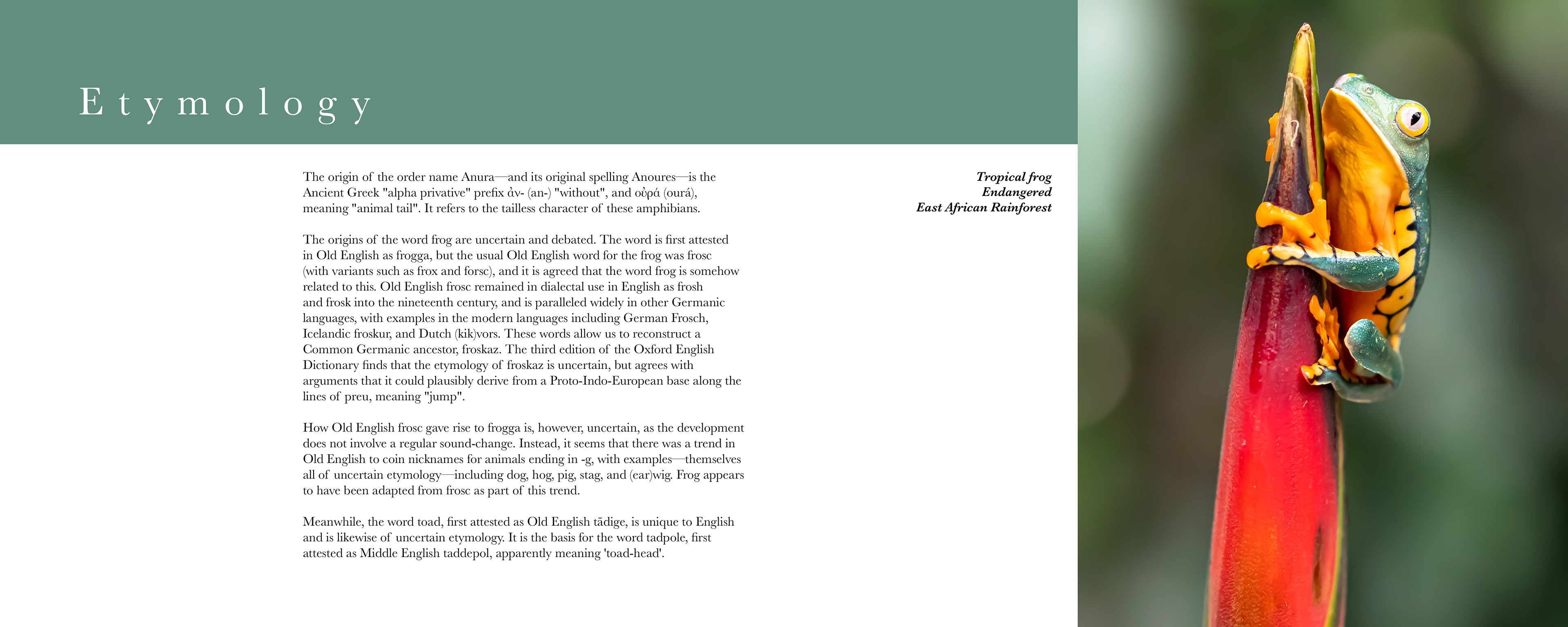
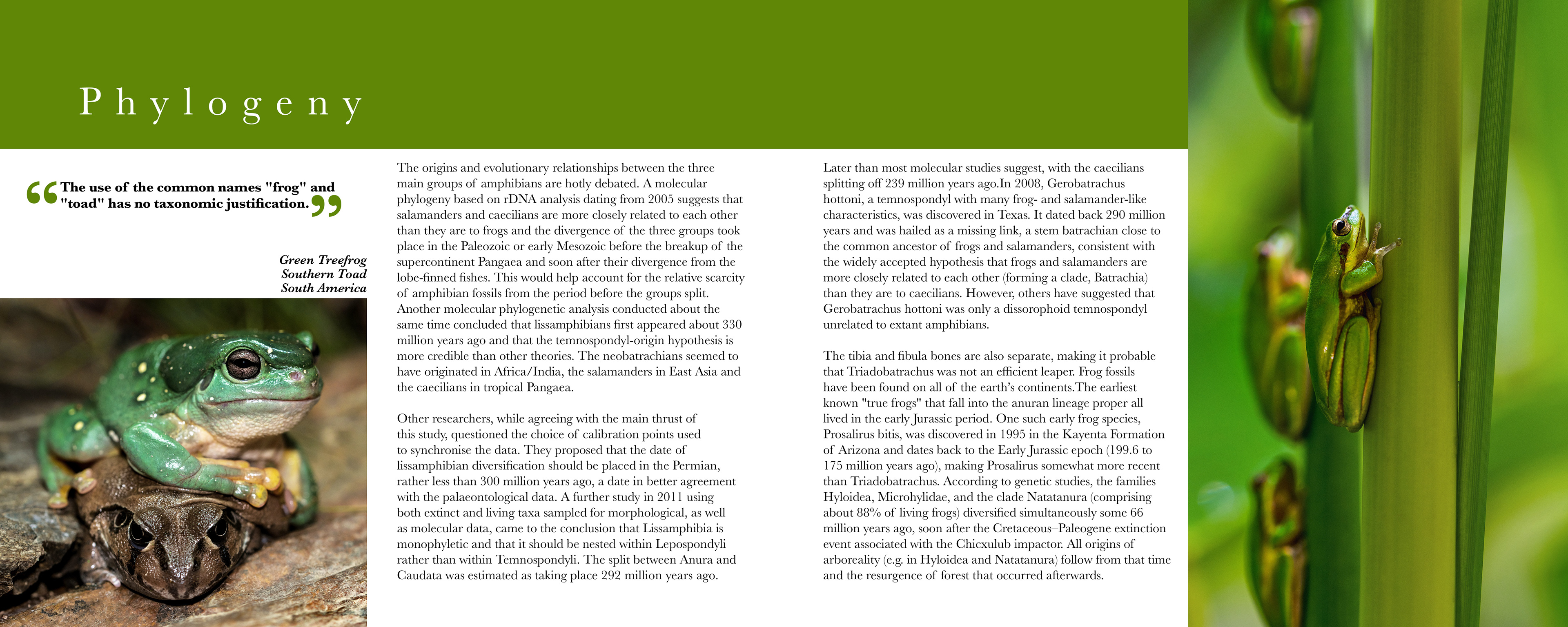
This coffee table book mixes whimsy with science, providing a fun but educational read. The page content flows through the spreads to create greater unity within the book, and draw interest even without reading.

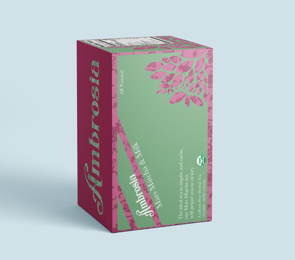
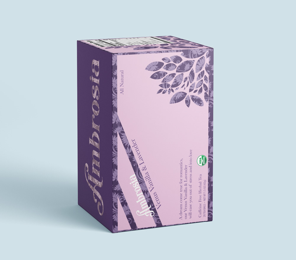
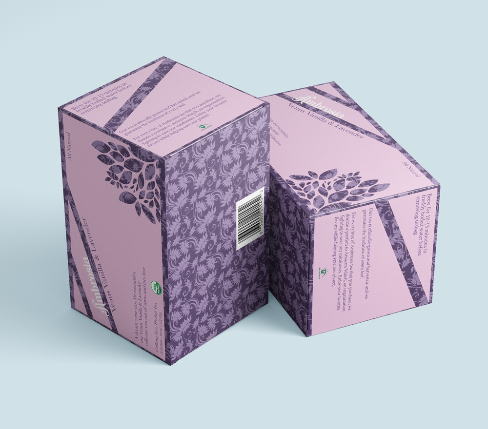
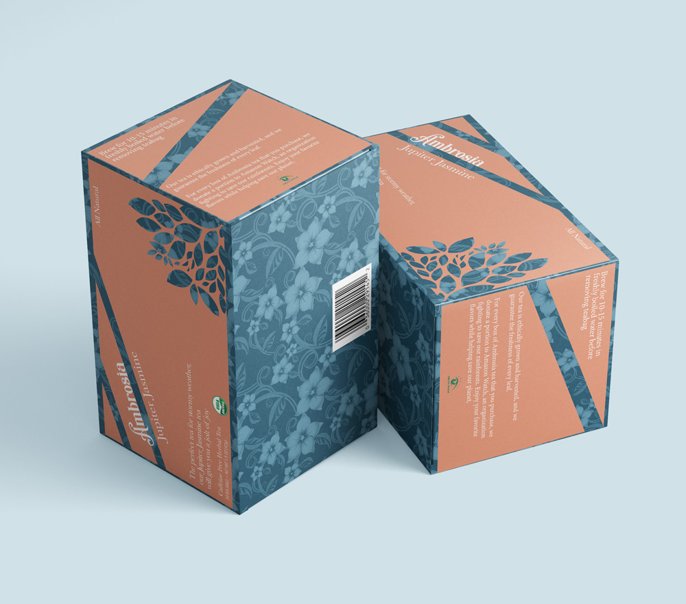
I was challenged to create a brand, logo, and box design for a tea company. Ambrosia tea is centered around the legendary drink of the roman gods. These designs evoke a sense of serenity, and each flavor is associated with a different roman god.


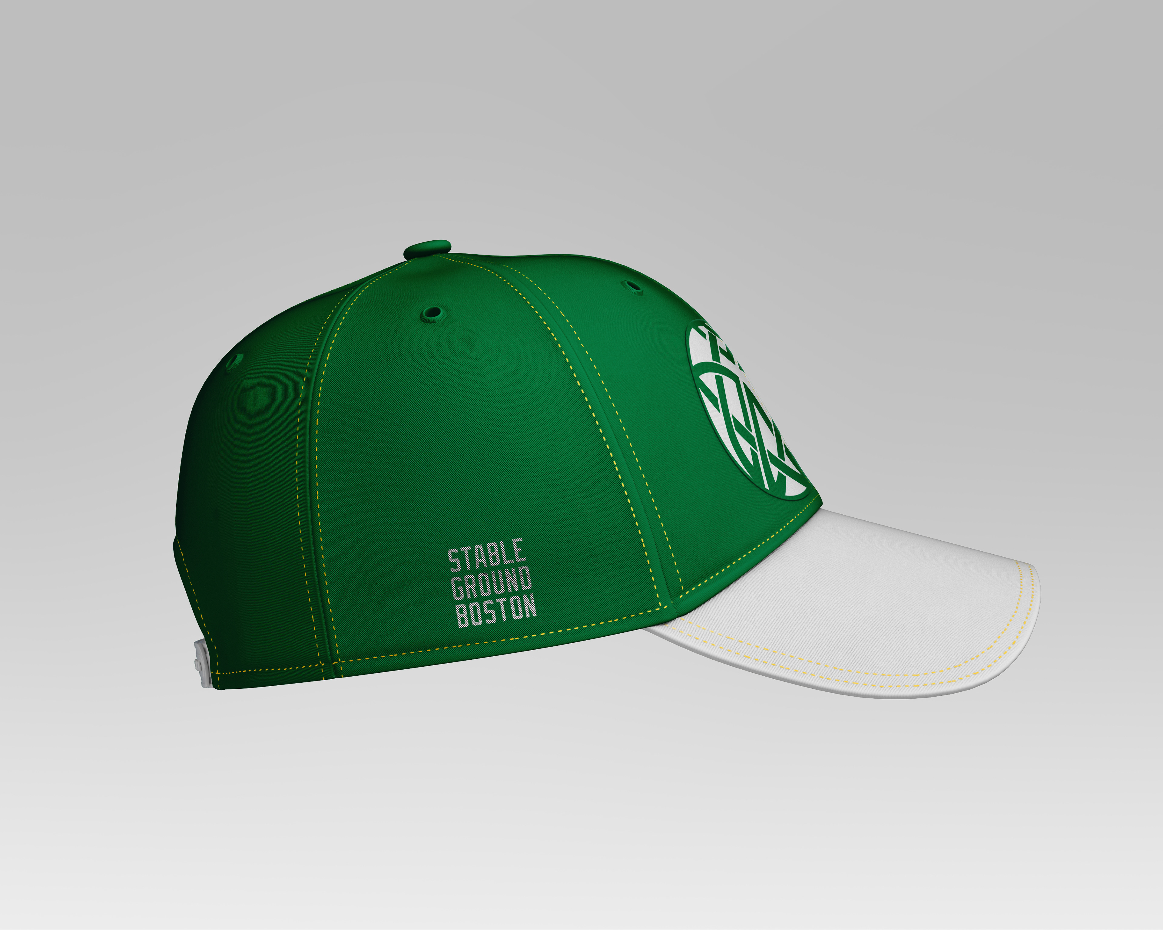
This logo redesign for the Boston Celtics draws from Celtic knots and symbology, and elevates the team to better fit with modern standards.

I was inspired to create a poster for International Unity Day. I chose this flowing design to show that peace has its ups and downs, but if we live in harmony we can construct balance.

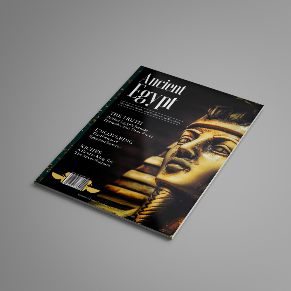
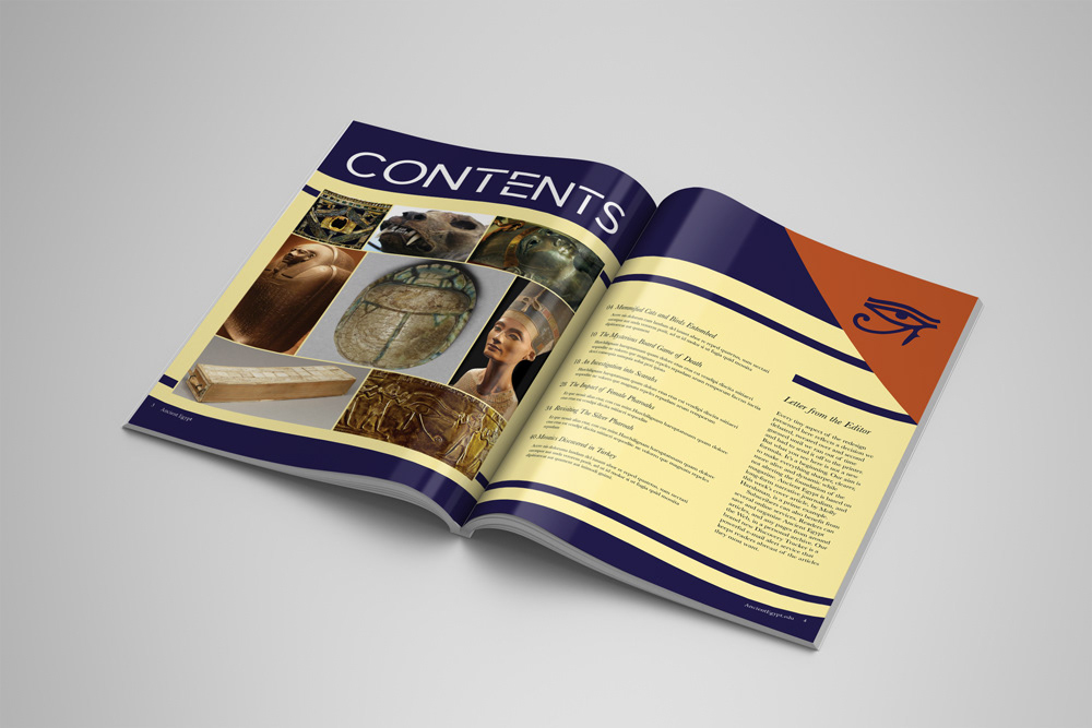
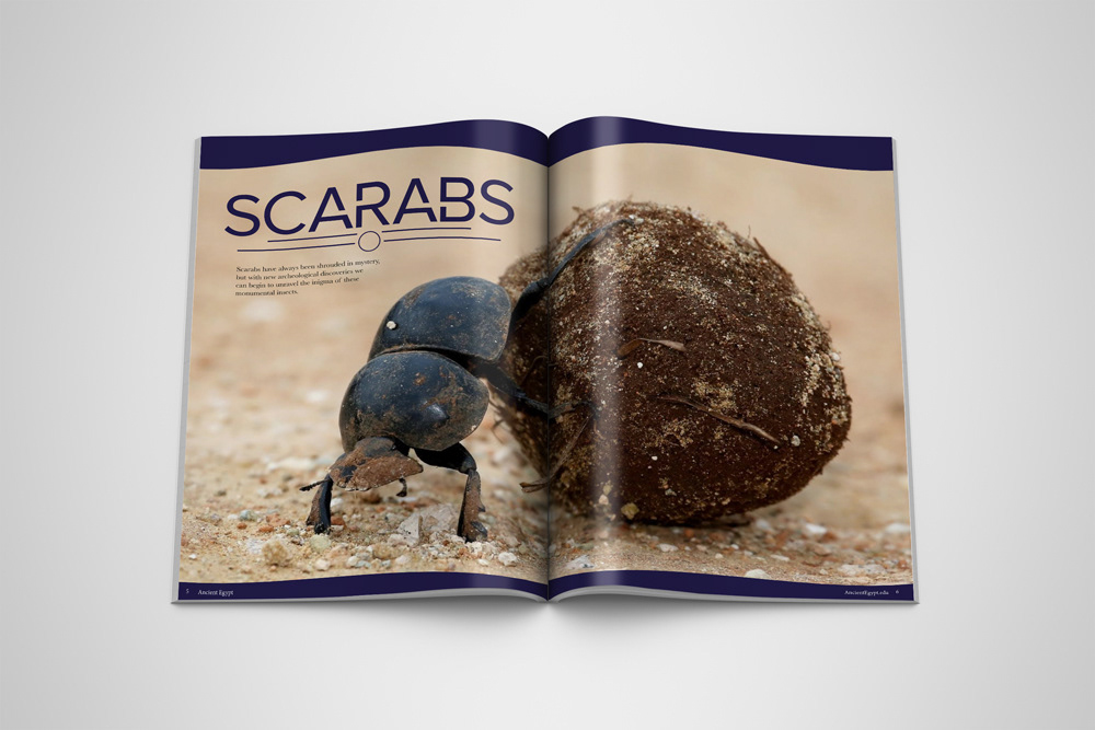
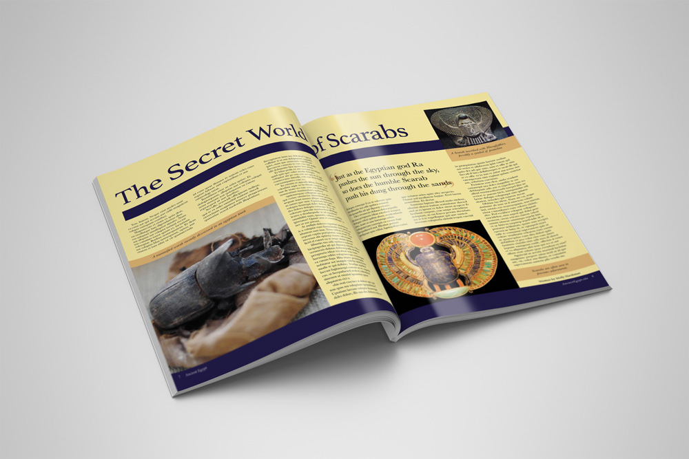
For this magazine redesign I wanted to focus on creating harmony between images and graphic elements. The layouts needed to be appealing but legible, and I achieved this by implementing typographic and illustrative solutions. I also focused heavily on moving away from their usual font, Papyrus.

The most dangerous tarot card to receive, The Tower is a symbol of upheaval and chaos. I represented this in the design through the crumbling tower and falling man. The sudden change this card brings launches its receiver into a space of uncertainty, highlighted by the vast emptiness of the cosmos.
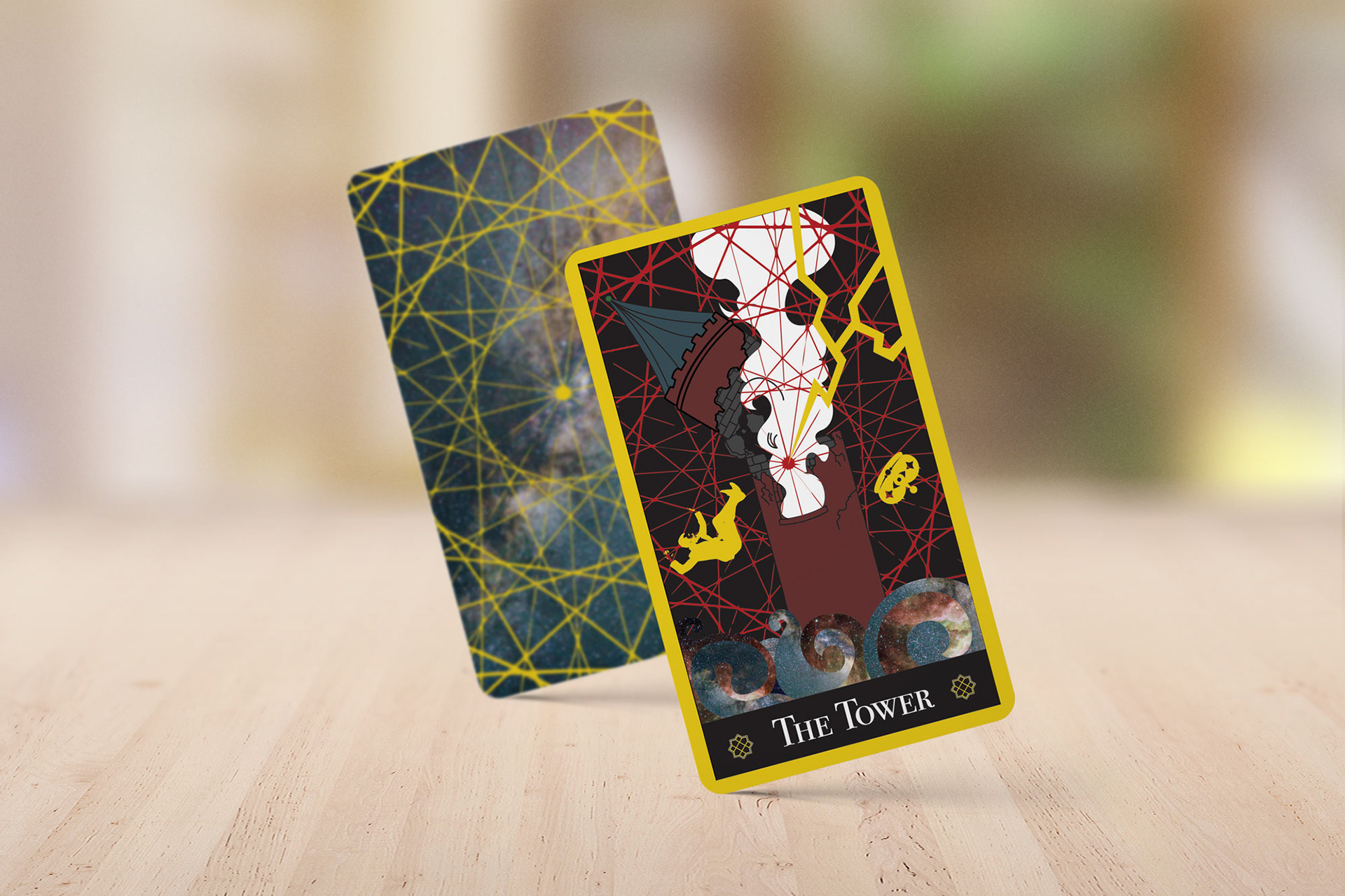
Tarot: The Tower
